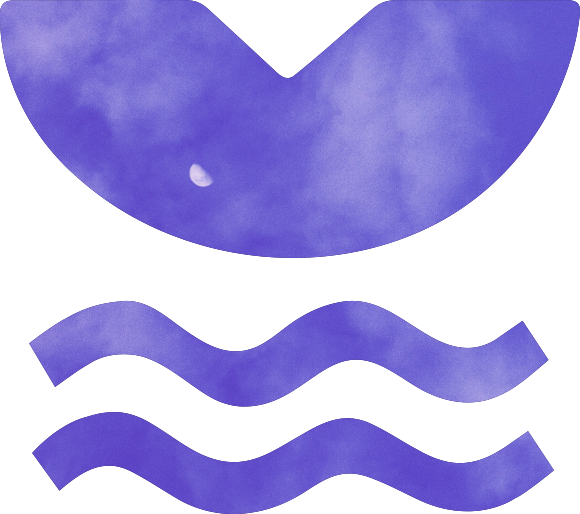
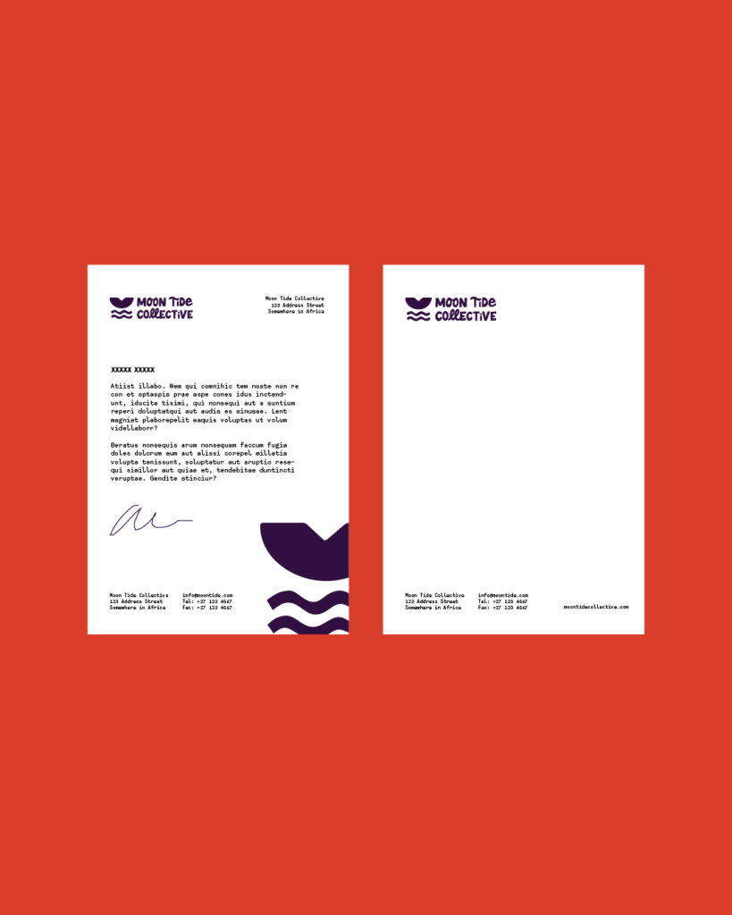
The refreshed Moon Tide Collective logo directly draws from the Fawohodie symbol, the core philosophical idea behind the Collective, aiming to honour and modernise it. The logo immediately conveys power and impact, presenting the Moon Tide Collective as a strong, collaborative entity.
The Collective’s values of curiosity, creativity, and integrity are reflected through the use of strong, solid shapes. The heavy sans-serif typography compliments the stylised, bold icon, balancing the strong graphic shapes.
The stylised Fawohodie is depicted as rising over the horizon and is reflected in a shimmering body of water beneath it. This water element represents power and strength, embodying the “tide” concept within the Collective’s name.
Our work encompassed: + Brand Redesign + Rollout of Brand Elements + Brand Guidelines